
Top 10 Data Science Blogs from Major Tech-Firms
We learn about important insights from trending data science posts published by great minds working at top firms.

Introduction
Data is everywhere, and that statement is unquestionable. With that being said, it is important for us to learn how to grow along with it, keep up with the changing times and strive to be updated with the latest trends. How can we do that? Well, this is where data science blogs come in.
Here in this post, we have collected - epitomized - presented all the major findings and learning in the published data science blogs from top tech firms. This post will majorly help you understand how data science is being used to redefine the way of thinking on an industry level.
Trending Data Science posts
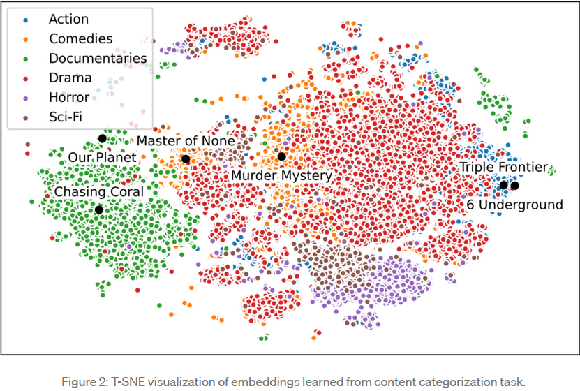
1. Netflix - Supporting Content Decision Makers with Machine Learning
- Introduction - The commissioning of a series or film is a creative decision. Executives throughout the entertainment industry have always consulted historical data to help characterize the potential audience of a title using comparable titles if they exist.
- Approach - The company's approach is rooted in transfer learning, whereby performance on a target task is improved by leveraging model parameters learned on a separate but related source task. All models are developed and deployed using meta flow, Netflix’s open-source framework for bringing models into production.
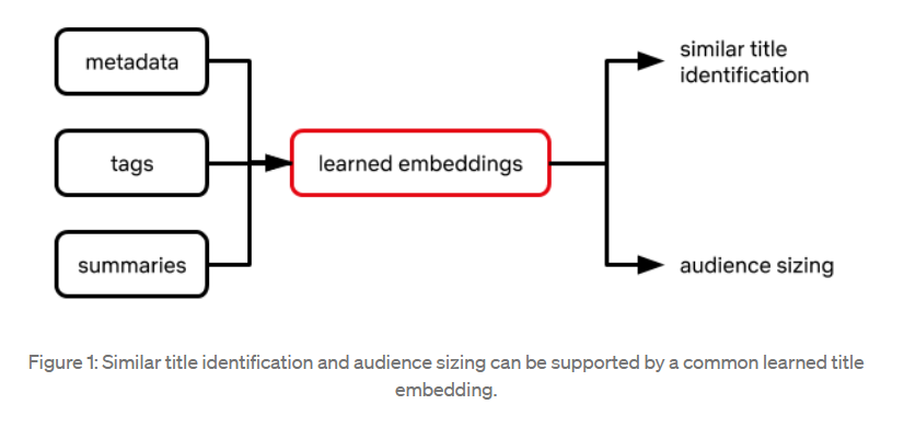
Similar titles - Netflix “embed” titles in a high-dimensional space or “similarity map,” wherein more similar titles appear closer together with respect to a spatial distance metric such as Euclidean distance.
Transfer learning for audience sizing - The following features are included in a supervised modeling framework that predicts audience size in a given country: Embedding of a title, Embedding of a country we’d like to predict audience size in and, Audience sizes of past titles with similar embedding (or some aggregation of them)
For more details on Netflix's Supporting content decision-makers with machine learning, visit here.
2. Stictchfix - Beware the data science pin factory: The power of the full-stack data science generalist and the perils of the division of labor through function
- Introduction - In The Wealth of Nations, Adam Smith demonstrates how the division of labor is the chief source of productivity gains using the vivid example of a pin factory assembly line. Data science is no exception. An end-to-end algorithmic business capability requires many data functions and companies usually create teams of specialists: research scientists, data engineers, machine learning engineers, causal inference scientists, and so on.

- Problem - With pins, the learning and design are done up-front, before you produce them. With data science, you learn as you go, not before you go. When the product is still evolving and the goal is to learn, specialization hinders our goals in several ways, such as - it increases coordination costs, exacerbates wait-time and narrows context.
- Solution - The solution to this problem is, of course, to get rid of the pin factory. In order to encourage learning and iteration, data science roles need to be made more general, with broad responsibilities agnostic to technical function. That is, organize the data scientists such that they are optimized to learn. This means hiring “full-stack data scientists”—generalists—that can perform diverse functions: from conception to modeling to implementation to measurement.
For more details on Stictchfix's Beware the data science pin factory: The power of the full-stack data science generalist and the perils of the division of labor through function, visit here.
3. Instacart - Don’t let the crows guide your routes
- Introduction - At the core of Instacart’s grocery delivery service is our Logistics engine that matches our customers’ orders with our shoppers. If our algorithm makes poor decisions with the grouping of orders, it could delay the timely delivery of our customers’ groceries. For the algorithm to make the best decisions, we need to pass inputs that are as accurate as possible.
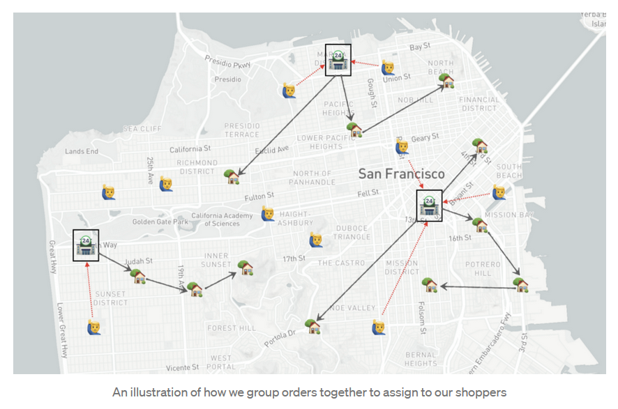
- Solution-
Types of distance - Haversine Distance, Mapbox Generated Distance.
A simple model to predict distance - We built the model with five features: latitude and longitude information of origin and destination points and their corresponding Haversine distance. The model was trained to predict the corrected actual distance as the target variable. Given the semi-static nature of distance, we set up an automatic job to retrain the model on a weekly basis.
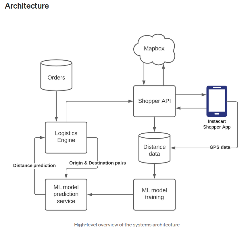
- Performance - The average MAPE of predicted distance we observed in a region like Orange County was 11% which is much smaller than that of Haversine distance (33%).
- Impacts - With a simple model described above, we were able to improve the accuracy of our distance computation and were able to avoid planning some bad routes we would’ve created otherwise using only Haversine distance. Using this model, we were able to reduce the distance traveled by our shoppers for multi-order trips by 9% across all the areas Instacart operates in, leading to millions of miles saved per year.
For more details on Instacart's Don’t let the crows guide your routes, visit here.
4. Spotify - Designing Data Science Tools at Spotify
- Introduction - Spotify operates at a massive scale: We have millions of listeners whose activities generate huge amounts of raw data. Raw data by itself is not that helpful though; we need to be able to process, manage, and distill it into insights that can inform new features or improvements to the experience. And to do that, we need usable, well-designed tools that ensure these insights can be easily understood.
- Design Challenge - We hypothesized that by improving ScienceBox by adding processing power, scaling discoverability, and using cloud infrastructure, we could help data scientists analyze data more efficiently, improve collaboration, and reduce the time to find insights in data. With the help of a visual workflow, we saw that we could group the type of work into two main types — “ad hoc querying” (i.e. quickly querying data to find immediate answers), and “long-term investigations” (structured projects with month-long timelines).
- What we learned - In rebuilding a crucial tool like ScienceBox in the cloud, we learned 3 important lessons along the way that informed our approach and ultimately led to a more effective tool. They were:
Quick actions make life easier
Design for discoverability
Highly variable workflows are normal
- More questions yet to be answered - Can all types of users who need notebooks easily use ScienceBox Cloud? How much faster can we enable our Data Scientists to work? How else can we help Spotifiers work more efficiently?
For more details on Spotify's Designing Data Science Tools at Spotify, visit here.
5. Airbnb - Data Science Belongs Everywhere
- Introduction - This post will mostly center around how to connect data science with other business functions, it's broken into three concepts — how we characterize data science, how it’s involved in decision-making, and how we've scaled it to reach all sides of Airbnb.
- Data Isn’t Numbers, It’s People - At Airbnb, data is characterized in a more human light: it’s the voice of our customers. Data science is an act of interpretation — we translate the customer’s ‘voice’ into a language more suitable for decision-making.
- Proactive Partnership v. Reactive Stats-Gathering - we have moved from a fully-centralized arrangement to a hybrid centralized/embedded structure: we still follow the centralized model, in that we have a singular data science team where our careers unfold, but we have broken this into sub-teams that partner more directly with engineers, designers, product managers, marketers, and others. Doing so has accelerated the adoption of data throughout the company, and has elevated data scientists from reactive stats-gatherers to proactive partners.
- Customer-driven decisions - Over time, we’ve identified four stages of the decision-making process that benefit from different elements of data science:
- Democratizing Data Science -

- Wrestling the train from the monkey - On the immediate horizon, we look forward to shifting from batch to real-time processing; developing a more robust anomaly detection system; deepening our understanding of network effects, and increasing our sophistication around matching and personalization.
For more details on Airbnb's Data Science Belongs Everywhere, visit here.
6. Airbnb - Using Sentiment Score to Assess Customer Service Quality
- Introduction - In this blog post, we provided details of sentiment model development and the framework of assessing sentiment metrics.
- For ML practitioners, the success of a sentiment analysis depends on domain-specific data and annotation guidelines. Our experiments show transformer-based classifiers perform better than CNN-based architectures, especially in less frequently used languages.
- For customer service providers who struggled with the pain of NPS, sentiment analysis has provided promising results to describe customers’ satisfaction levels. If you have user communication text, exploring sentiment analysis may solve the long-lasting pain of NPS. However, if you only have phone call recordings, exploring audio to text transcription could be a good start before exploring emotion detection in audio.
- For data analysts and data scientists, the framework of metrics development from a new signal (model output) is reusable: considering many user feedback metrics are either slow or sparse, data professionals can assess the new signals from coverage, sensitivity, and causal relationship with business values. For causal analysis challenges, it is worth spending some time to explore the new Entropy Balancing techniques, which may save you time from Propensity Score Matching.
For more details on Airbnb's Using Sentiment Score to Assess Customer Service Quality, visit here.
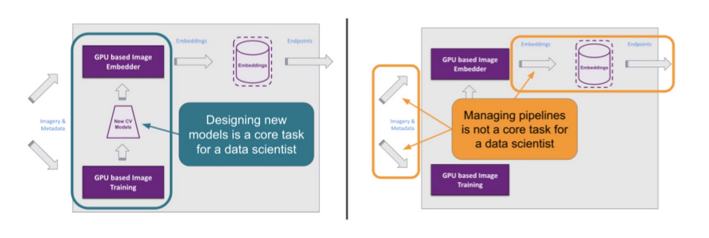
7. Wayfair - Hoover: How to Enable Data Scientists to Stop Managing ETL Pipelines and Get Back to Doing Data Science
- Introduction - In this blog post we showed how we at Wayfair use the model-view-controller (MVC) architecture design pattern to develop lightweight, Jupyter-friendly tools for data pipeline abstraction. Hoover empowers data scientists to onboard onto existing projects on day 1 and to self-serve the creation of new ETL pipelines with minimal engineering support, allowing data scientists to spend more of their time doing data science instead of software engineering.
- Section 1: Case Study: RoSE—Room and Style Estimator -
We at Wayfair use the RoSE Room and Style Estimator, developed by our team of computer vision data scientists, to quantify the “style” of a room based on an image so we can better understand what our customer is looking for and, more importantly, help her find it. - Section 2: The model-view-controller (MVC) Framework -
In this section, we pause our case study to describe the MVC framework and how we will use it. - Section 3: Case Study (Part 2): Hoover—Image Ingestion Pipeline Client -
In this section, we will describe how we use the MVC framework as a metaphor to structure our code. - In our Hoover example, all a data scientist needs to provide are these functions:
Image Processing
1. Input and output formatting.
2. Converting image resource descriptors into network and file paths.
3. The transformations to be applied.
Dataset Building
1. Data construction (e.g. constructing image pairs/triples for Siamese networks) and sampling.
2. Label construction (e.g. one-hot encoding).
For more details on Wayfair's Hoover: How to Enable Data Scientists to Stop Managing ETL Pipelines and Get Back to Doing Data Science, visit here.
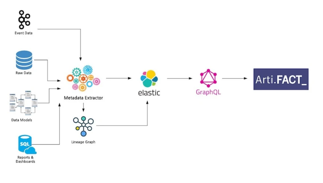
8. Shopify - How We’re Solving Data Discovery Challenges at Shopify
- Introduction - To make sense of all the data assets at Shopify, we built a data discovery and management tool named Artifact. It aims to increase productivity, provide greater accessibility to data, and allow for a higher level of data governance.
- Problem - The data discovery issues at Shopify can be categorized into three main challenges: curation, governance, and accessibility.
1. Curation - 80% of the data team at Shopify felt the pre-Artifact discovery process hindered their ability to deliver results. This sentiment dropped to 41% after Artifact was released.
2. Governance - Data governance is a broad subject that encompasses many concepts, but our challenges at Shopify are related to a lack of granular ownership information and change management.
3. Accessibility - Our challenge here is surfacing relevant, well-documented data points our stakeholders can use to make decisions. - Solution - Artifact, Shopify’s Data Discovery Tool: Artifact is a search and browse tool built on top of a data model that centralizes metadata across various data processes. Artifact allows all teams to discover data assets, their documentation, lineage, usage, ownership, and other metadata that helps users build the necessary data context. This tool helps teams leverage data more effectively in their roles.
- What’s Next for Artifact? - Our short-term roadmap is focused on rounding out the high-impact data assets that didn’t make the cut in our initial release and integrating with new data platform tooling.
In the mid to long term, we are looking to tackle data asset stewardship, change management, introduce notification services, and provide APIs to serve metadata to other teams.
The future vision for Artifact is one where all Shopify teams can get the data context they need to make great decisions.
For more details on Shopify's How We’re Solving Data Discovery Challenges at Shopify, visit here.
9. Floydhub - The Future of AI is Open
- Introduction - This Humans of ML interview with Han Xiao covers the ethics of AI, open-source entrepreneurship, how writing made Han a better coder, and more.
- Background - Han Xiao is the founder and CEO of Jina AI. Jina AI is a neural search company that provides cloud-native neural search solutions powered by AI and deep learning. He has been working in the field of AI, and especially in open-source AI, for some time.
- Change in AI over the timespan -
- Open Source Software & Strategy - Jina AI is a neural search company. Jina is our core product, released on April 28th, 2020. The official tagline we put on our Github repository is: Jina is a cloud-native neural search solution powered by state-of-the-art AI and deep learning. To put it simply, you can use Jina to search for anything: image-to-image, video-to-video, tweet-to-tweet, audio-to-audio, code-to-code, etc.
- Skills - I believe that making a good speech or presentation is a must-have soft skill for developers. In China, the slogan "Talk is cheap, show me the code" is pretty popular in tech companies. If you want to learn something, read about it. If you want to understand something, write about it. If you want to master something, teach it.
- Across borders - Today, the world seems to be at the downfall of globalization. Rabid nationalism and racism have gained popularity in multiple countries. Cross-border collaboration, especially in the high-competitive field such as AI, is at an impasse. But don't lose your faith. Nationalism and racism are eternal human themes, they rise and fall. They will fall when we realize that as humans, we really aren't so different after all.
- Book recommendations - Gödel, Escher, Bach: An Eternal Golden Braid is really a good starting point for those who are interested in AI. You don't need any programming background to read this book; you just need to be curious about intelligence itself.
For more details on Floydhub's The Future of AI is Open, visit here.
10. Tableau - Reflecting on a decade of data science and the future of visualization tools
- Introduction - This blog post will summarize several of the key takeaways from this research paper (Passing the Data Baton: A Retrospective Analysis on Data Science Work and Workers) and share my thoughts on how its findings can help us build the next generation of data visualization tools for data science.
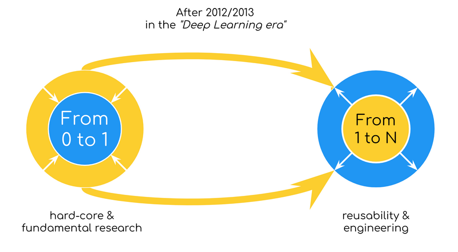
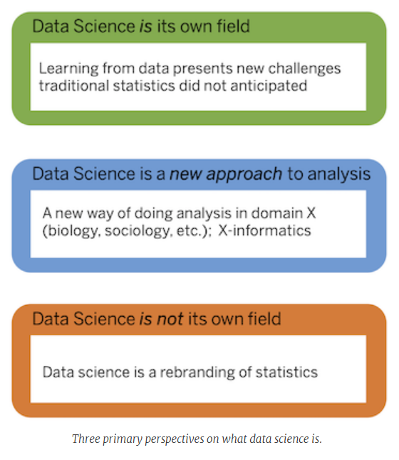
- What is data science?
Data science is a multidisciplinary field that aims to learn new insights from real-world data through the structured application of primarily statistical and computational techniques.
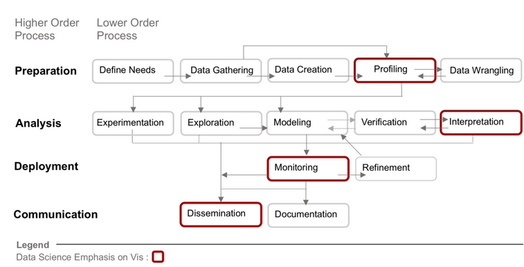
- What is data science work?
Distilling data science work into four higher-order (Preparation, Analysis, Deployment, and Communication) and 14 lower-order processes. The processes outlined in red are those where data visualization is predominately used, but this doesn’t preclude its use in other aspects of data science work.
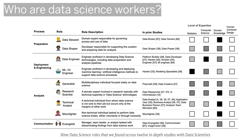
- Who are data science workers?
As data science work grew in complexity, data scientists became less generalized and more specialized, often engaged in specific aspects of data science work. Interviews conducted by Harris et al. as early as 2012 already identified this trend, which has only accelerated over time. Astutely, they observed that this diversity among the data science role leads to “miscommunication between data scientists and those who would seek their help”.
- How does this change the way we build visualization and data analysis tools?
First and foremost, it helps by making the diversity of data science work and workers explicit and grounded in evidence. Most importantly, this framework also helps me think about what’s missing in the current ecosystem of visual analytics tools.
For more details on Tableau - Reflecting on a decade of data science and the future of visualization tools, visit here.
Conclusion
In this blog post, we have tried to highlight important insights from trending data science posts published by great minds working at top firms.
To have a detailed explanation of particular areas please go through the official websites attached with each bullet point.
Hope you find this article fruitful.
Stay tuned and have a nice day!
Like us on Twitter
Data Science is a HUGEEE competitive advantage for the top Internet companies in the world.
— datascience.fm (@DatascienceFm) January 21, 2022
Read how some of the best companies in the world are using Data Science 🔥🔥🔥🔥
👇👇👇https://t.co/cFfCRYL9FO
👆 👆 👆 #python #DataScience pic.twitter.com/iWb9OZO0Rr


