
Tutorial to write SQL queries using Python and visualizing the results in Tableau - Part 3

Another business problem for your SQL and tableau learning regime. Here we'd be dealing with the code and how to visualize it in Tableau.
Dataset: Vehicles.csv
What makes a car worth buying? It is the cost-effectiveness and a brand name that is linked to it. All the manufacturers in the industry are trying to give maximum features even in the lowest model. So a person either prefers a brand name or an economical price that he can afford.
We will learn how to analyze the given dataset using python codes and visualize the same result in Tableau.
SQL Query in Python
Following is the SQL query in Python
!pip install pandasql
import pandas as pd
pd.set_option('display.max_rows', 100)
pd.options.display.float_format = '{:.5f}'.format
import pandasql as ps
from IPython.display import HTML
sql_query = """
select avg(price) as average_price,manufacturer
from vehicles
where (type="sedan") and (transmission="automatic") and
(price between 1 and 655000)
group by manufacturer
order by avg(price)
"""
res_df = ps.sqldf(sql_query, locals())
HTML(res_df.to_html(escape=False))The following table will come as output:
| average_price | manufacturer | |
|---|---|---|
| 0 | 4053.84615 | saturn |
| 1 | 4748.46237 | mercury |
| 2 | 5487.59836 | pontiac |
| 3 | 7133.14741 | buick |
| 4 | 7250.49123 | mitsubishi |
| 5 | 8557.50000 | fiat |
| 6 | 8620.64062 | mazda |
| 7 | 8866.75420 | ford |
| 8 | 9096.56325 | chevrolet |
| 9 | 9553.11151 | honda |
| 10 | 9624.80090 | hyundai |
| 11 | 9643.02857 | volkswagen |
| 12 | 10047.06991 | toyota |
| 13 | 10163.55289 | nissan |
| 14 | 10821.60127 | chrysler |
| 15 | 10832.41235 | kia |
| 16 | 11135.66968 | subaru |
| 17 | 11267.17227 | acura |
| 18 | 11396.14407 | volvo |
| 19 | 12194.71429 | jeep |
| 20 | 12928.81068 | infiniti |
| 21 | 12943.43478 | lincoln |
| 22 | 12989.00328 | cadillac |
| 23 | 14080.45763 | dodge |
| 24 | 16479.11957 | jaguar |
| 25 | 16686.55247 | bmw |
| 26 | 16757.97550 | lexus |
| 27 | 16971.22727 | mini |
| 28 | 17997.00000 | gmc |
| 29 | 18295.50959 | mercedes-benz |
| 30 | 19230.02878 | None |
| 31 | 20766.51420 | audi |
| 32 | 22725.00000 | ram |
| 33 | 28686.57143 | alfa-romeo |
| 34 | 32172.92857 | tesla |
| 35 | 42491.73333 | porsche |
The above table gives us the average price of the vehicle corresponding to the manufacturer(brand).
Visualizing the result in Tableau
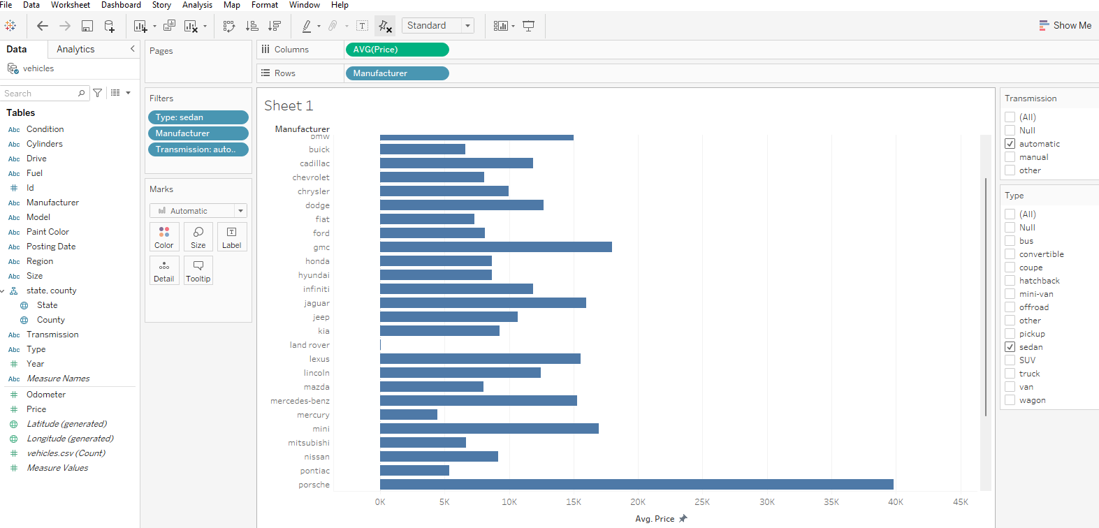
Tableau is a tool to visualize your data in a way that you can filter the data using the price or the manufacturer's name as we have done in this blog.
Drag the Price and Manufacturer to Rows and Columns respectively.
Also dragging Transmission=automatic, Manufacturer, and Type=sedanto filter in the left.
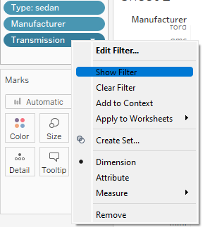
To show the filters in the right corner we can right-click on a particular filter and click on show filter, as shown below:
Now, the SQL query demands the data should be filtered using the price range from 1 to 65,50,00. Therefore, we add a price filter and select the given range and finally get the names of the manufacturers that were on top by averaging out the price of each.
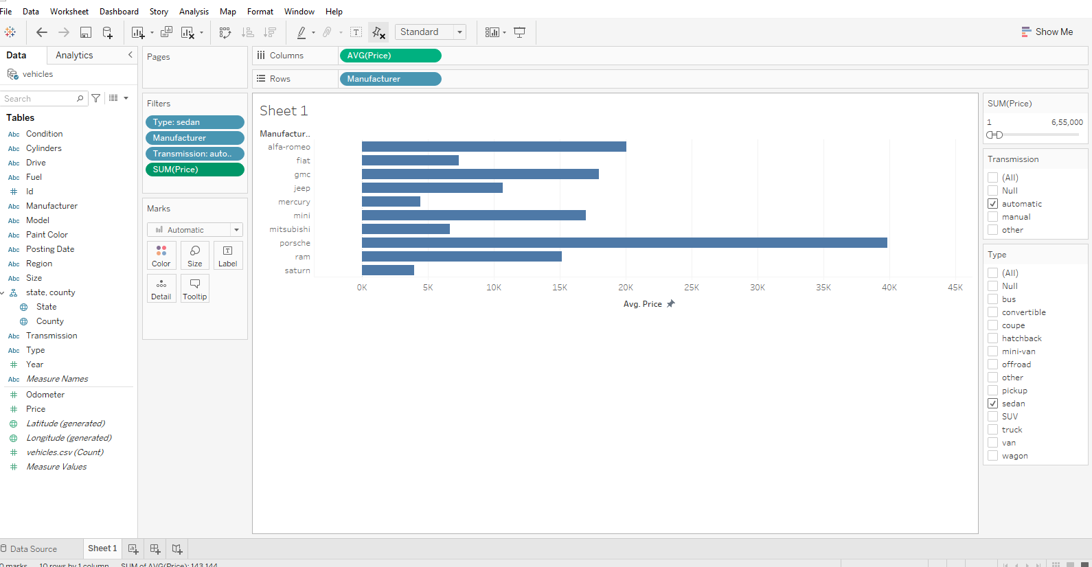
We have plotted our result using a horizontal bar graph. Here, it is used to compare the various price among manufacturers.
The one with the largest spread is the one having the highest average pricing.
Bar Graph: A bar graph is a specific way of representing data using rectangular bars where the length of each bar is proportional to the value they represent. It is basically a graphical representation of data using bars of different heights.
Here, we have Porsche with the maximum highest price.
Conclusion
We have plotted our SQL query in Tableau and also learned how to use and show filters to sort them out.
This was a quick guide to visualize your SQL queries in Tableau using a bar graph.
Hope this was helpful.
Stay tuned for the upcoming Tableau series.

