
Tutorial to write SQL queries using Python and visualizing the results in Tableau - Part 1

This post walks you through the SQL queries in the Kaggle python notebook and shows you how to visualize them using Tableau.
We are taking the following dataset for our reference:
Dataset: Used Cars Dataset
How has the price of vehicles changed over the years?
Thinking about buying a used car? Then we need to analyze how the price of different cars has changed over the years and how that might affect future prices. In our previous SQL series, we discussed the "Craigslist used cars dataset" (link above) and discussed the various factors that affect the price of the car, be it the distance traveled, time of its purchase, or the brand. The price of a car reduces as it gets older and older.
In our previous SQL series, we discussed how to write queries. Today, we will talk about how to visualize those results in Tableau.
SQL Query in Kaggle
Following is the code to load necessary libraries in the Kaggle notebook to run your SQL queries.
import numpy as np # linear algebra
import pandas as pd # data processing

!pip install pandasql
pd.set_option('display.max_rows', 100)
pd.options.display.float_format = '{:.5f}'.format
import pandasql as ps
from IPython.display import HTML
Next, we have the SQL query to select vehicles at a particular price range and group them by the year of manufacturing to calculate whether a vehicle's price is affected by the year of its manufacturing.
SELECT Avg(price)AS average_price,
       year
FROM   vehicles
WHERE  price BETWEEN 1 AND 655000
GROUP BY year; | average_price | year | |
|---|---|---|
| 0 | 39384.35887 | NaN |
| 1 | 1999.33333 | 1900.00000 |
| 2 | 100.00000 | 1901.00000 |
| 3 | 5000.00000 | 1915.00000 |
| 4 | 21900.00000 | 1920.00000 |
| 5 | 15000.00000 | 1922.00000 |
| 6 | 16886.66667 | 1923.00000 |
| 7 | 11833.33333 | 1924.00000 |
| 8 | 10000.00000 | 1925.00000 |
| 9 | 10583.66667 | 1926.00000 |
| 10 | 13416.66667 | 1927.00000 |
| 11 | 26866.50000 | 1928.00000 |
| 12 | 23617.85714 | 1929.00000 |
| 13 | 17619.16667 | 1930.00000 |
| 14 | 20399.94444 | 1931.00000 |
| 15 | 34036.92308 | 1932.00000 |
| 16 | 58500.00000 | 1933.00000 |
| 17 | 24719.28571 | 1934.00000 |
| 18 | 10000.00000 | 1935.00000 |
| 19 | 28075.00000 | 1936.00000 |
| 20 | 24599.93750 | 1937.00000 |
| 21 | 6465.00000 | 1938.00000 |
| 22 | 26386.75000 | 1939.00000 |
| 23 | 26140.17647 | 1940.00000 |
| 24 | 25840.41667 | 1941.00000 |
| 25 | 24250.00000 | 1942.00000 |
| 26 | 11761.46154 | 1946.00000 |
| 27 | 18880.00000 | 1947.00000 |
| 28 | 23829.72727 | 1948.00000 |
| 29 | 19962.82609 | 1949.00000 |
| 30 | 10529.06897 | 1950.00000 |
| 31 | 22152.36842 | 1951.00000 |
| 32 | 20289.20000 | 1952.00000 |
| 33 | 14300.21739 | 1953.00000 |
| 34 | 17589.58333 | 1954.00000 |
| 35 | 31010.00000 | 1955.00000 |
| 36 | 20008.50000 | 1956.00000 |
| 37 | 24255.11765 | 1957.00000 |
| 38 | 18727.77778 | 1958.00000 |
| 39 | 24349.40000 | 1959.00000 |
| 40 | 18126.41176 | 1960.00000 |
| 41 | 18774.68750 | 1961.00000 |
| 42 | 17777.39130 | 1962.00000 |
| 43 | 16797.29167 | 1963.00000 |
| 44 | 14487.17544 | 1964.00000 |
| 45 | 23074.98387 | 1965.00000 |
| 46 | 18976.40625 | 1966.00000 |
| 47 | 20567.78824 | 1967.00000 |
| 48 | 20401.75000 | 1968.00000 |
| 49 | 31741.01205 | 1969.00000 |
| 50 | 17379.22222 | 1970.00000 |
| 51 | 18103.29825 | 1971.00000 |
| 52 | 18745.01149 | 1972.00000 |
| 53 | 14596.85246 | 1973.00000 |
| 54 | 13155.59615 | 1974.00000 |
| 55 | 12524.39286 | 1975.00000 |
| 56 | 9137.73810 | 1976.00000 |
| 57 | 10833.83929 | 1977.00000 |
| 58 | 11701.24691 | 1978.00000 |
| 59 | 11749.24691 | 1979.00000 |
| 60 | 11559.46809 | 1980.00000 |
| 61 | 9264.56863 | 1981.00000 |
| 62 | 10726.79487 | 1982.00000 |
| 63 | 9985.03030 | 1983.00000 |
| 64 | 8310.40244 | 1984.00000 |
| 65 | 9278.32184 | 1985.00000 |
| 66 | 11124.78641 | 1986.00000 |
| 67 | 10982.11009 | 1987.00000 |
| 68 | 9976.32143 | 1988.00000 |
| 69 | 7932.36207 | 1989.00000 |
| 70 | 7930.28926 | 1990.00000 |
| 71 | 7159.19658 | 1991.00000 |
| 72 | 9340.10484 | 1992.00000 |
| 73 | 7932.73973 | 1993.00000 |
| 74 | 7791.28571 | 1994.00000 |
| 75 | 9550.36404 | 1995.00000 |
| 76 | 9549.94636 | 1996.00000 |
| 77 | 8249.66766 | 1997.00000 |
| 78 | 7511.40566 | 1998.00000 |
| 79 | 8679.17483 | 1999.00000 |
| 80 | 7393.17699 | 2000.00000 |
| 81 | 7611.78471 | 2001.00000 |
| 82 | 7079.10738 | 2002.00000 |
| 83 | 7487.86367 | 2003.00000 |
| 84 | 7642.66414 | 2004.00000 |
| 85 | 8302.91257 | 2005.00000 |
| 86 | 8536.31916 | 2006.00000 |
| 87 | 8837.61229 | 2007.00000 |
| 88 | 9661.51915 | 2008.00000 |
| 89 | 9681.30271 | 2009.00000 |
| 90 | 10702.25058 | 2010.00000 |
| 91 | 13714.09688 | 2011.00000 |
| 92 | 15055.66599 | 2012.00000 |
| 93 | 16127.65714 | 2013.00000 |
| 94 | 18890.75078 | 2014.00000 |
| 95 | 22142.77637 | 2015.00000 |
| 96 | 23632.19509 | 2016.00000 |
| 97 | 26777.76141 | 2017.00000 |
| 98 | 29488.20022 | 2018.00000 |
| 99 | 33312.31478 | 2019.00000 |
| 100 | 36845.25795 | 2020.00000 |
| 101 | 36155.48700 | 2021.00000 |
| 102 | 3414.50000 | 2022.00000 |
You can copy and paste the SQL query we shared in your notebook and see how the query works on data. After taking the data using queries you can create visualizations using tableau which we have discussed in the next section.
How to do it in Tableau?
"Data visualization is the presentation of abstract information in graphical form. Data visualization allows us to spot patterns, trends, and correlations that otherwise might go unnoticed in traditional reports, tables, or spreadsheets."
Thus to read the data better we'll be using Tableau for visualizing the out of our queries.
Following is the Tableau Window, with the data already loaded.
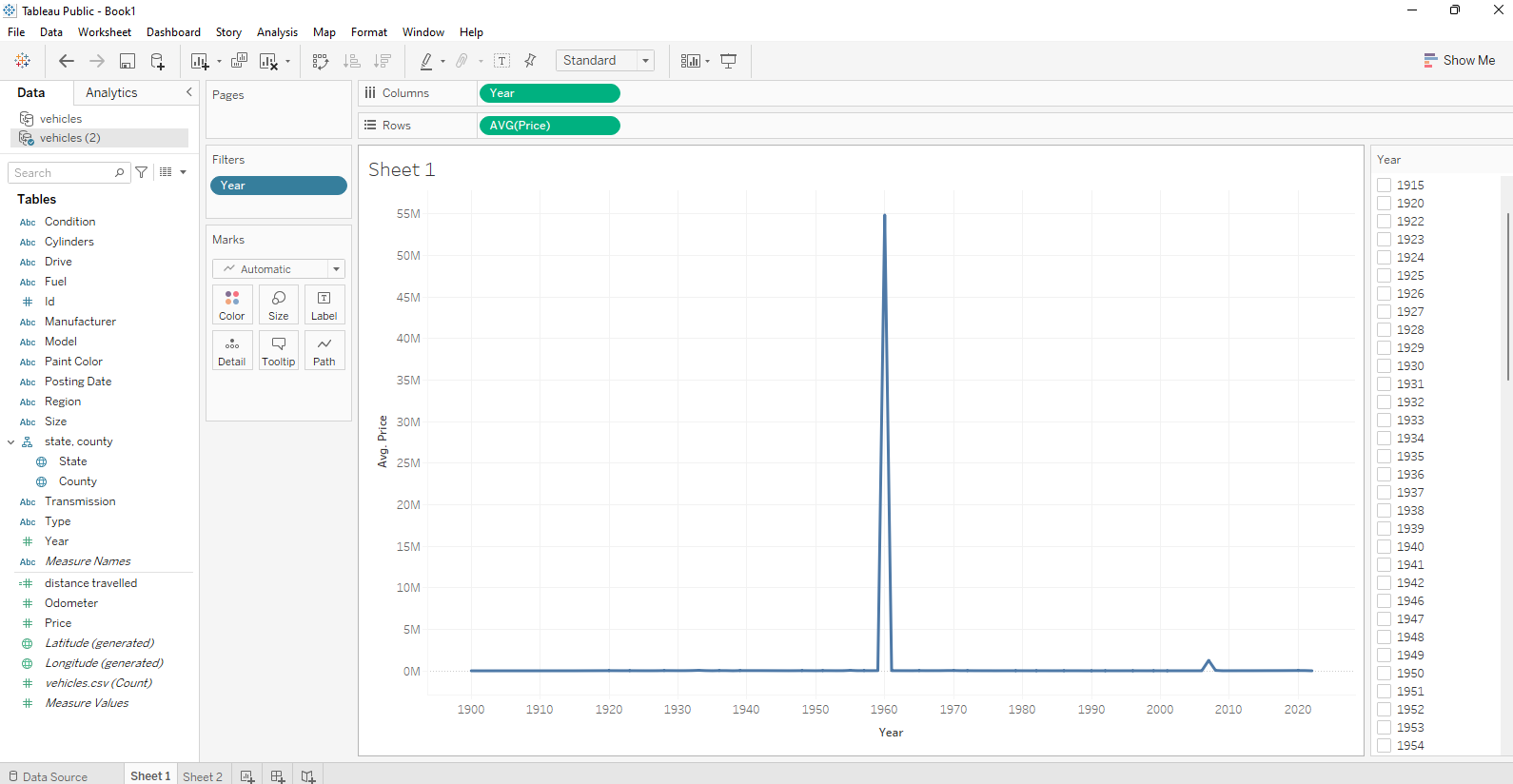
In the above visualization, we have plotted "Year" against "Average Price".
X-axis/Columns : Year
Y-axis/Rows: AVG(Price)
We select the above specifications by dragging the Year from tables to columns and Avg(price) to the rows.
When we plot our data we see that the year '1960' and '2007' are outliers, which makes the rest of the data negligible and hard for us to observe.
Therefore, we will remove these outliers.
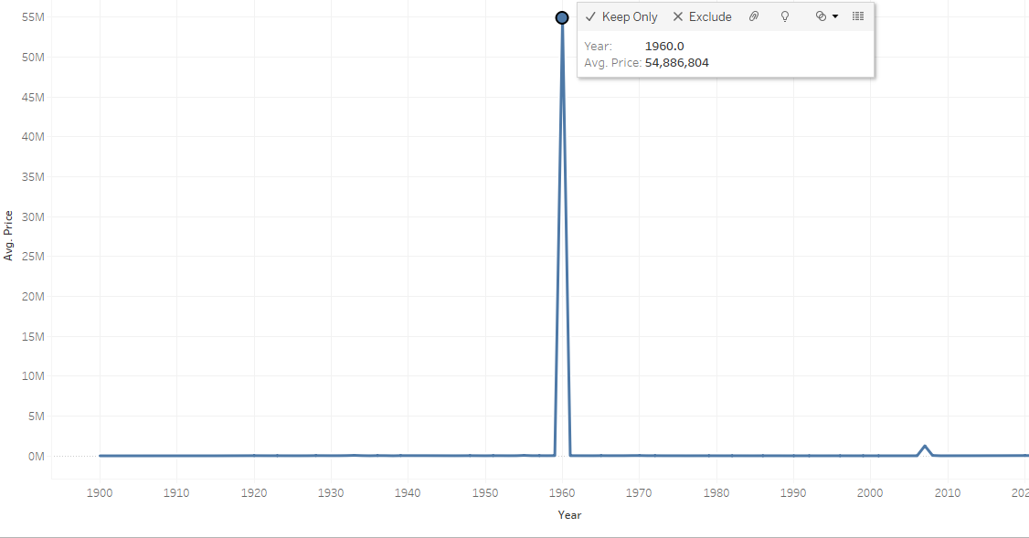
We click on the year '1960; and see some options in the pop-up box. Here, we can exclude the particular outliers to let data make sense using the Exclude option.
Now, we observe our graph. We have selected an Area Graph for this query.
Area Graphs are Line Graphs but with the area below the line filled in with a certain colour or texture. Area Graphs are drawn by first plotting data points on a Cartesian coordinate grid, joining a line between the points and finally filling in the space below the completed line.
Area graphs combine the line chart and bar chart to show how one or more groups’ numeric values change over the progression of a second variable, typically that of time, and is distinguished from a line chart by the addition of shading between lines and a baseline, like in a bar chart.
Let's see how the final plot looks like.
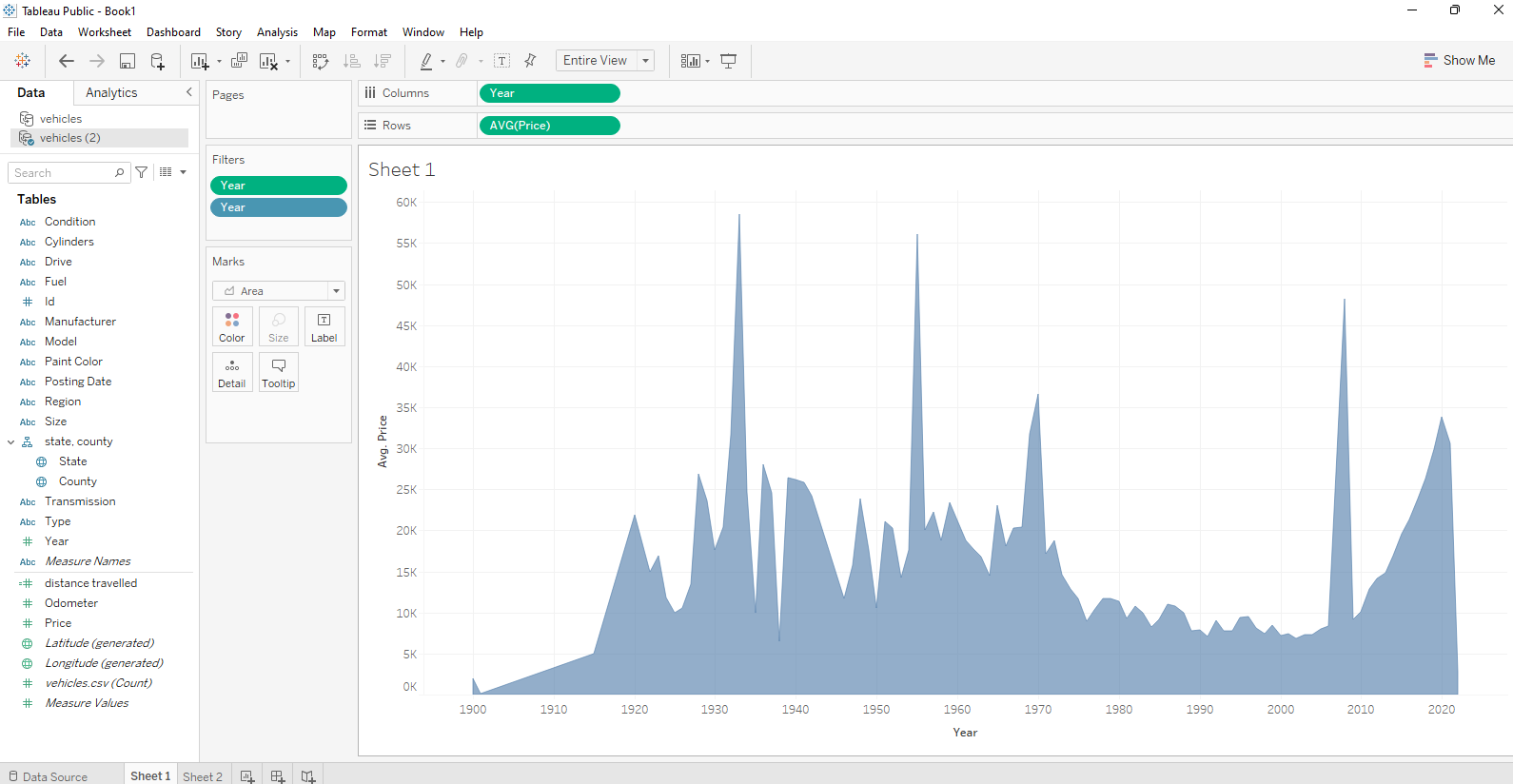
Interpretation
After removing the outliers we can see the data is following a trend that is quite interpretable and shows how the average price of used cars varies across years. Among all the years that were taken into consideration, the few such as the year 1935, 1955 that is touching the peak have the highest pricing of used cars. Also, a sudden dip at 1938 indicates that the used cars price was lowest for this particular year.
In the tableau, we can create many more visualizations for the same thing using the 'Show me' button at the top right corner. Also, in the marks field, we can choose the drop-down button and select from the different types of graphs available.
Conclusion
In the following series, we would be sharing different SQL queries in python and their visualization using Tableau. We're using Tableau because it is much easier and convenient than other python libraries that are being used for plotting various graphs and visualizing the dataset such as seaborn, matplotlib, etc.
We will publish many such articles in the days to come so stay tuned for more such queries and exciting graphs around the same.

