
Tutorial to write SQL queries using Python and visualizing the results in Tableau - Part 2

Introduction
By seeing your interest in the previous SQL queries posts, we have curated this series to work any query in a more structured way by firstly understanding the objective behind carrying out this activity.
Secondly, by working out the query in Kaggle to get the desired table.
Thirdly, by plotting the given query and data in Tableau software to visualize the results better.
Lastly, by interpreting the result from the final visualizations.
We will make use of Tableau software to visualize the data to have a better understanding of the trend we are expecting to see.
Don't worry! We have everything covered in a step-by-step guide for all new software we make use of.
Dataset used: Used Car Dataset
Business Problem
How does the price vary for different vehicle types across distance travelled?
Now, be it vehicles or any other material - we all know that the physical condition of any object tends to degrade when it is in continuous use for a long period of time. Which is the reason, why we have a varying price range for vehicles according to the distance travelled by it in past.
When we want to buy second-hand material, there are many factors to keep in mind like - age of the material, quality of material, maintenance of the material, etc. In our SQL query, we will try to focus on the distance travelled by the vehicles by taking the odometer reading into consideration and then checking the trend in the price range of the vehicles.
So, let's get started!
SQL Query in Kaggle
Let us start by importing necessary libraries to run our queries the way they are expected:
import numpy as np # linear algebra
import pandas as pd # data processing, CSV file I/O (e.g. pd.read_csv)
import os
for dirname, _, filenames in os.walk('/kaggle/input'):
    for filename in filenames:
        print(os.path.join(dirname, filename))
!pip install pandasql
import pandas as pd
pd.set_option('display.max_rows', 100)
pd.options.display.float_format = '{:.5f}'.format
import pandasql as ps
from IPython.display import HTML
In the next step, we will read the CSV file for the given dataset and try to run the query for the given business problem:
df = pd.read_csv("/kaggle/input/used-car-dataset/vehicles.csv")
sql_query = """
SELECT Avg(price) AS average_price,
       CASE
         WHEN odometer >= 0
              AND odometer <= 20000 THEN '0-20000'
         WHEN odometer > 20000
              AND odometer <= 40000 THEN '20000-40000'
         WHEN odometer > 40000
              AND odometer <= 60000 THEN '40000-60000'
         WHEN odometer > 60000
              AND odometer <= 80000 THEN '60000-80000'
         WHEN odometer > 80000
              AND odometer <= 100000 THEN '80000-100000'
         WHEN odometer > 100000 THEN '<100000'
         ELSE 'NA'
       END        AS distance_travelled
FROM   vehicles
WHERE  price BETWEEN 1 AND 655000
GROUP  BY distance_travelled;
"""

res_df = ps.sqldf(sql_query, locals())
HTML(res_df.to_html(escape=False))
Please take the help of the above-created code to run the query in your Kaggle notebook and you will see an output of the form:
| average_price | distance_travelled | |
|---|---|---|
| 0 | 31967.90281 | 0-20000 |
| 1 | 28056.35262 | 20000-40000 |
| 2 | 24530.75175 | 40000-60000 |
| 3 | 20457.13645 | 60000-80000 |
| 4 | 16202.87367 | 80000-100000 |
| 5 | 11298.36823 | <100000 |
| 6 | 18653.63095 | NA |
The above given is the table for the average price of the vehicles for the given range of distance travelled.
As we all know that humans process visual data better. Let us try plotting the above result pictorially to capture the price trend better.
Tableau Visualization
With the help of fast analytics and rapid-fire business intelligence, let us go step by step to create the desired visualizations:
Step 1:
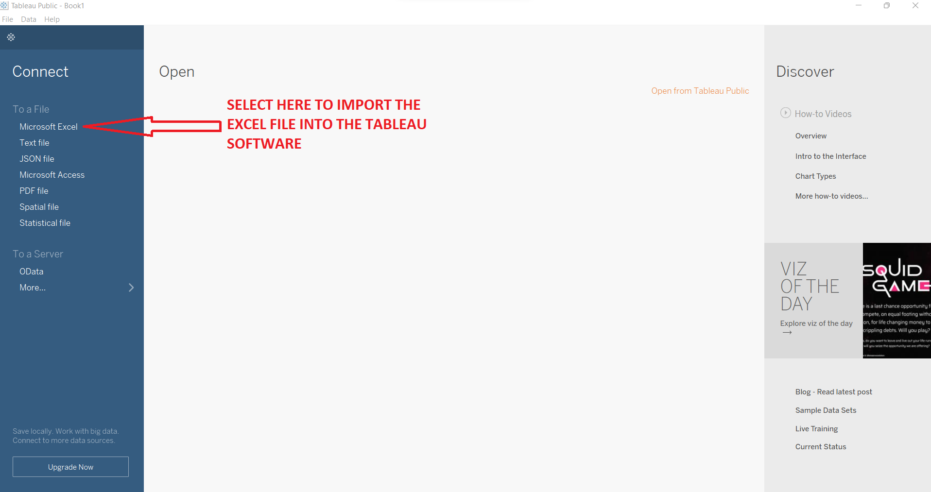
Import Excel file into Tableau using the 'Connect to a file' option.
Step 2:
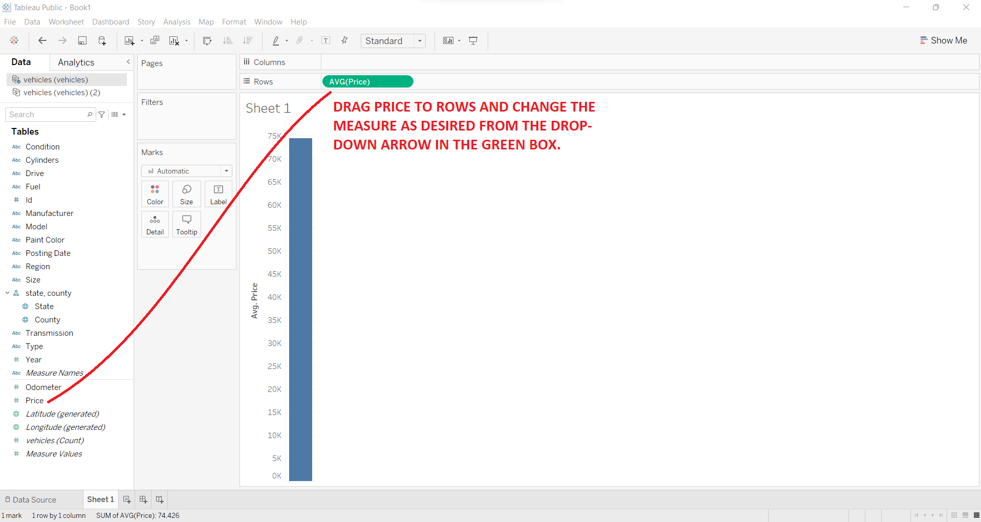
Drag the 'Price' quantity from the left index to the 'Rows' tab given in the middle top screen. Make sure to change the measure type as needed. For this query, we are using average.
Step 3:
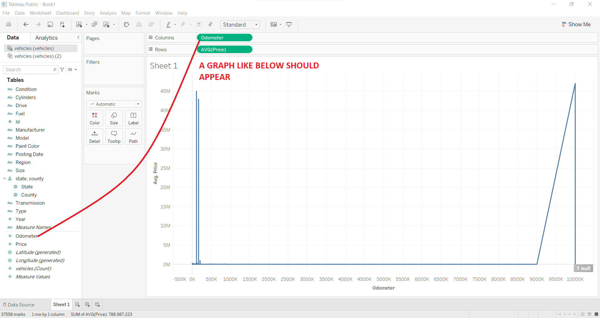
Now drag another component i.e. Odometer from the left table to the 'Columns' tab given just above 'Rows'. Make sure to change the type from Measure to Dimension from the drop-down given in the green box.
Step 4:
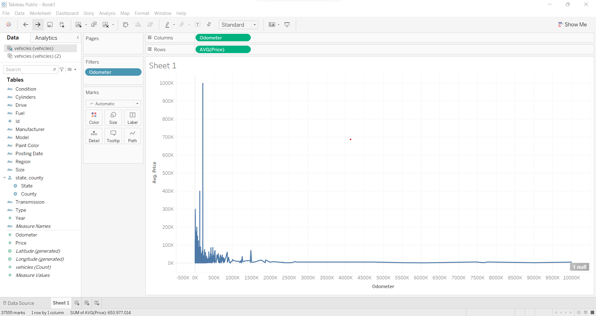
Now, in order to analyze the results better, let us remove the outliers from the data by 'excluding' these points from the data by clicking right on the given data point on the graph. After removing outliers, the graph should look like the below figure.
Interpretation
It is evident from the above-plotted table and the graph, that the price of the vehicle decreases as the distance travelled by the vehicle increases.
Hence, we can say that our assumption that as distance travelled increases, the price of the vehicle decreases, holds true. And, distance travelled by any vehicle and its price is negatively correlated.
Which is the reason why we have the maximum average price for the vehicles which have covered the least distance in the different odometer reading categories and the minimum average price for the most distance covered range.
Conclusion
We observed that you very well enjoyed working out the SQL queries in the previous posts, hence we decided to take a step further to make this activity much more fruitful and interesting in terms of dealing with queries and understanding them from a business point of view.
We really hope that this series will help create value among data enthusiasts.
Stay tuned for upcoming posts!

