
Multiple Plots using Ggplot2

I am a big fan of the tidyverse set of libraries, especially ggplot2
While there is a raging debate on the use of base-r vs tidyverse to teach R to beginners, I will choose tidyverse for the convenience and for the connected ecosystem of many libraries that provide a ton of convenience with using R.
In the post below I show how one can use ggplot2 to visualise the distribution of various track features from the Spotify dataset. I use RStudio for this exercise and recommend you do the same.
# _ _ _
# | | | | | |
# | | | | ___| | ___ ___ _ __ ___ ___
# | |/\| |/ _ \ |/ __/ _ \| '_ ` _ \ / _ \
# \ /\ / __/ | (_| (_) | | | | | | __/
# \/ \/ \___|_|\___\___/|_| |_| |_|\___|
#
#
# Load Libraries
library(readr)
library(ggplot2)
library(dplyr)
library(gridExtra)
library(stringr)
# Dataset is the Spotify tracks data available at https://www.kaggle.com/yamaerenay/spotify-dataset-19212020-160k-tracks?select=data_o.csv
df <- read_csv("data_o.csv", col_names=TRUE)
# _ _ _ _ _ _ _
# | | | (_) | (_) | | (_)
# | | | |_ ___ _ _ __ _| |_ ______ _| |_ _ ___ _ __
# | | | | / __| | | |/ _` | | |_ / _` | __| |/ _ \| '_ \
# \ \_/ / \__ \ |_| | (_| | | |/ / (_| | |_| | (_) | | | |
# \___/|_|___/\__,_|\__,_|_|_/___\__,_|\__|_|\___/|_| |_|
#
#
# Distribution of danceability
ggplot(df, aes(danceability)) +
geom_histogram() +
ggtitle("Distribution of danceability")
# Combining plots
p1 <- ggplot(df, aes(danceability)) +
geom_histogram() +
ggtitle("Distribution of danceability")
p2 <- ggplot(df, aes(acousticness)) +
geom_histogram() +
ggtitle("Distribution of acousticness")
p3 <- ggplot(df, aes(liveness)) +
geom_histogram() +
ggtitle("Distribution of liveness")
p4 <- ggplot(df, aes(speechiness)) +
geom_histogram() +
ggtitle("Distribution of speechiness")
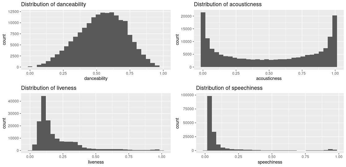
gridExtra::grid.arrange(p1, p2, p3, p4, ncol = 2)I choose four variables from the dataset to plot.
The above approach to tile the plots is fine but is cumbersome given one has to individually create the plots. What if we could loop through the variables and create the plots? There are a couple of ways to do this.
# Assign the columns of interest to a variable
target_variables <- c("danceability", "acousticness", "liveness", "speechiness")

# Loop through each column name
for (each_variable in target_variables) {
  # Create a variable name to which the plot will be assigned
  plot_var_name <- str_c(c("ggplot", each_variable), collapse = "_")
  print(plot_var_name)
  # Compute the mean value of the variable
  mean_val <- round(mean(df[, each_variable][[1]]), 3)
  print(mean_val)
  # Construct the plot
  temp_plot <- ggplot(df, aes_string(each_variable)) + # NOTE - aes_string rather than aes
    geom_histogram(binwidth = 0.05) +
    ggtitle(str_c("Distribution of ",each_variable)) +  # Title of the plot
    geom_vline(xintercept = mean_val, color = "blue", lty = "dashed")
  # Assign the plot to plot name
  assign(plot_var_name, temp_plot)
}

gridExtra::grid.arrange(ggplot_danceability, ggplot_acousticness, ggplot_liveness, ggplot_speechiness, ncol = 2)
There is a lot going on in the above snippet.
We create a variable name for each target column. This variable will be assigned the plot once it is created using assign. The reason we do this is to capture the plot in its own independent variable name so we can reference it later.
Typically when we assign a value to a variable we invoke foo <- 42 in R which assigns the value 42 to the variable foo. But in the code snippet above we are looping through the column names and construction a plot each time. To save the plot each time we construct it, we assign the plot object to a variable name.
Once the loop completes, we use grid.arrange to plot.
This still feels more work than necessary, in that, you have to explicitly call out the variable names for each of the plots. Can we do better?
You can use lapply and do away with creation of variables the way we are doing the for loop.
# Use lapply
my_plots_list <- lapply(target_variables, function(each_variable) {
  ggplot(df, aes_string(each_variable)) + # NOTE - aes_string rather than aes
    geom_histogram(binwidth = 0.05) +
    ggtitle(str_c("Distribution of ",each_variable)) +  # Title of the plot
    geom_vline(xintercept = mean_val, color = "blue", lty = "dashed")
})

gridExtra::grid.arrange(grobs = my_plots_list, ncol = 2)
In the snippet above you apply a function on each column name that constructs the plot. The plot object once constructed is returned and the variable my_plots_list contains the four plot objects.
You then pass the list of plot objects, my_plots_list to grid.arrange and your grid of variable distributions is rendered.