Explore the Twitter graph dataset and learn how to analyze complex graphs using simple exploratory data analysis (EDA)


Introduction

Most of us think of Twitter as a social network, but it's actually something much more powerful!
Twitter is a social news website. It can be viewed as a hybrid of email, instant messaging and SMS messaging all rolled into one neat and simple package. It's a new and easy way to discover the latest news related to subjects you care about.
Your tweets are public and don't disappear into thin air. Anyone can follow you and see your updates and you can follow anyone you like — easy peasy! There is no approval process at the beginning and no well-defined network of acquaintances to whom you can address your posts. Everyone is welcome to use Twitter as they please and there's nothing stopping anyone from broadcasting their tweets to everyone.
Today, we will talk about a Twitter Graph Dataset and focus solely on how basic Exploratory Data Analysis (EDA) can be performed on the same.
Let's first revise what EDA is.
- Exploratory Data Analysis - It is an approach of analyzing data sets to summarize their main characteristics, spot patterns and interesting outliers, eliminate the duff data, conduct tests to find the best subset of variables to use for modeling purposes and use statistical graphs and other plotting methods to visualize the data.
Now that we understand why EDA is such a crucial step in understanding any dataset, we now have a step-by-step process for how to go about doing that as well.
So let's begin!
Dataset:
We are working on the Twitter Graph Dataset. You can access the same from here.
The link includes 2 files, nodes.csv and edges.csv, however, for this article we will work with only the latter.
edges.csv: This files contains the friendship/followership network among the bloggers. The friends/followers are represented using edges. Edges are directed.
Data Analysis:
Let's first start by importing the packages we need:
'''
Importing Packages
'''

import random
import numpy as np
import pandas as pd


import matplotlib.pyplot as plt
import plotly.express as px
import seaborn as sns
from pywaffle import Waffle


import networkx as nx
from pyvis.network import Network
We have successfully imported the needed packages. Let's move further.
Second step is to read the .csv file provided, i.e., edges.csv and rename its columns headers ('Follower' - 'Target').
'''
Reading the .csv file with pandas
'''
twitter_df = pd.read_csv('../input/twitter-edge-nodes/Twitter-dataset/data/edges.csv',
                 header=None, names=['Follower','Target'])
Now, let's look at the dataframe structure. Using the following line of code for the same:
# Geting the first 10 entries
twitter_df.head(10)
We see that the dataframe has two columns one for follower ID and the other for the target ID.
Statistical Overview:
Let's look at the NA and duplicate values in our dataset. We do this by using the functions .isna() and .duplicate(). The .sum() function, in the end, returns the sum of all the NA and duplicate values to us.
'''
Checking for missing values and duplicates
'''
twitter_df.isna().sum()
twitter_df.duplicated().sum()
By checking the dataset we can ensure that it has no duplicates and no missing values.
We can check the statistical overview of the dataset using DataFrame.describe() function:
# Statistical overview of dataframe
twitter_df.describe()
The describe() function gives us the 5 number summary, including standard deviation (std), mean, and count as well.
However, Mean, Max and Std are meaningless in our case here because the values represent IDs rather than continuous numerical data.
Visualizations:
Let's take a breather. It's time to have some fun!
We start with the visualizations now.
First, we need to create a helper function to help us plot followers easily. We use the following codes for the same:
'''
Function to get random follower id
Where range is from 0 to maximium of follower column
'''
def get_random_follower () :
    max_follower = twitter_df['Follower'].max()
    random_follower = random.randint(0,max_follower)
    twitter_df_select = twitter_df[twitter_df.Follower==random_follower]
    return twitter_df_select,random_follower
This function randomly selects a user (follower) from the dataset.
'''
Function to create Nx graph for a follower
Given :
twitter_df_select : a subset of df where follower data is available
follower_id : the id of the follower
'''
def create_graph (twitter_df_select , follower_id):
    # create graph from edges
    Grph = nx.from_pandas_edgelist(twitter_df_select, 'Follower', 'Target', create_using=nx.DiGraph())
    # and plot
    nx.draw(Grph, with_labels=True, node_size=2000
            , alpha=0.7, arrows=True)
    plt.title('Targets that ' + str(follower_id) + ' follows',
             fontdict = {'fontsize' : 20})
    plt.show()
The second function takes a subset from the follower dataframe and a follower ID and plots it using the Networkx library.
Now let's run the functions above twice and view the results, this can be done using the code below:
# Choosing a random follower
twitter_df_select,random_follower = get_random_follower()
# creating a graph for that follower
create_graph(twitter_df_select,random_follower)

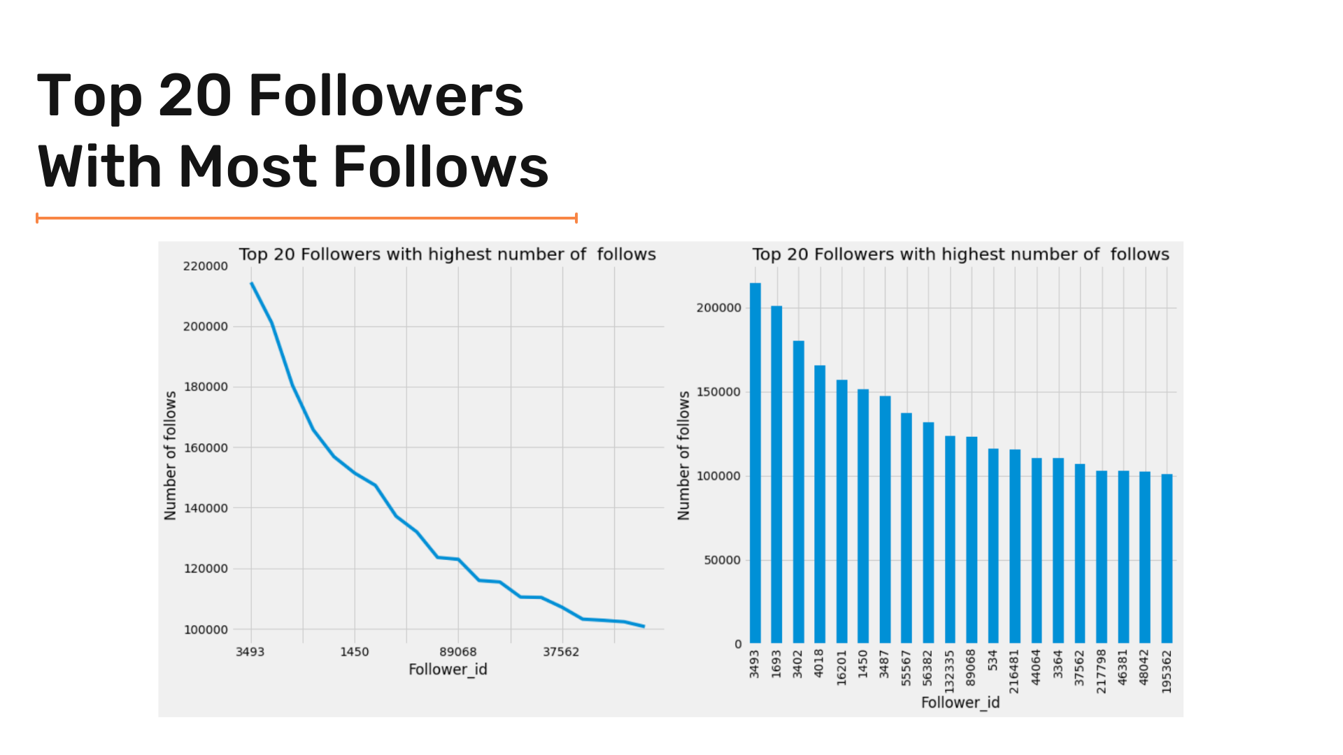
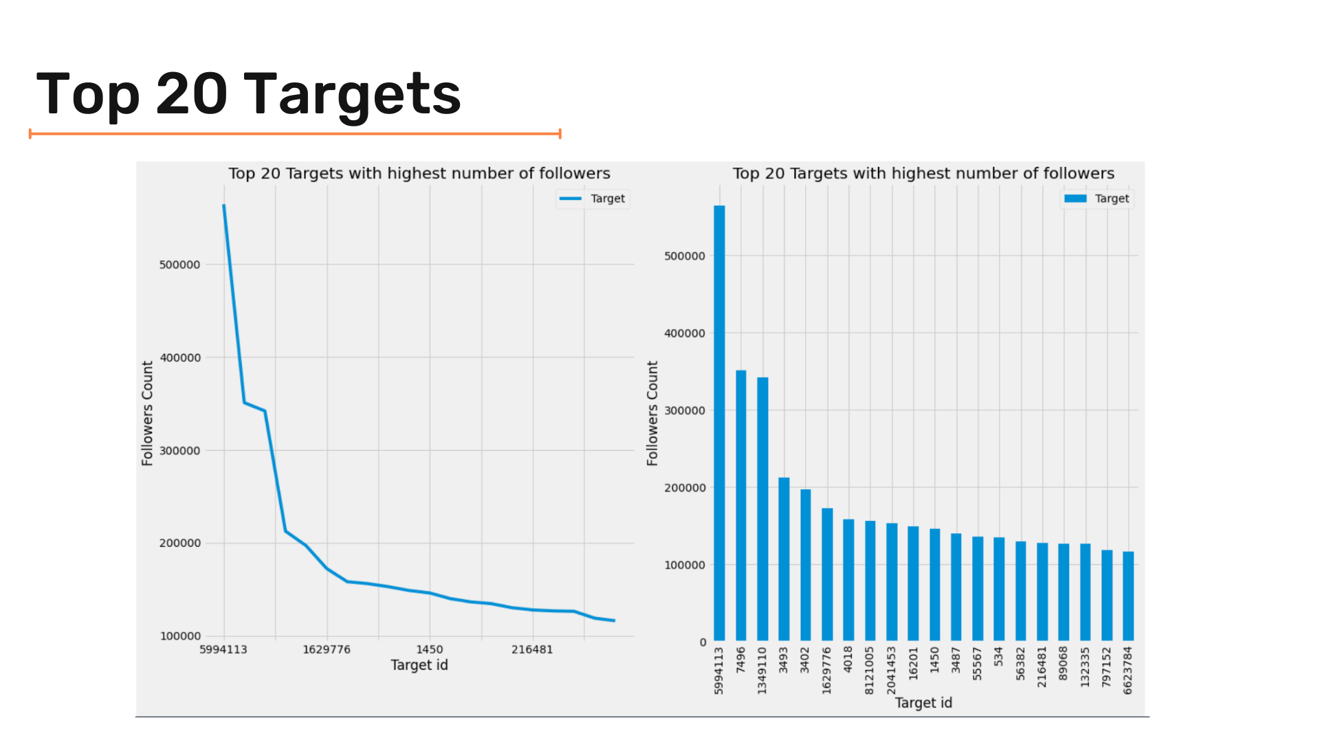
Now let's plot followers with the most followers. Since we have many entries, we can plot the top 10 or/and the top 20 results to have a clear graph and visuals.
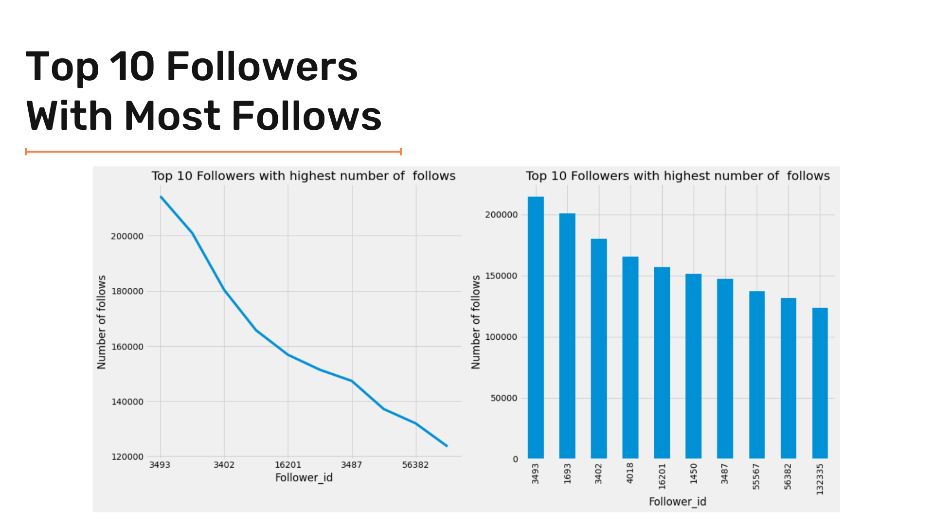
We are starting with the top 10 entries. To get the top 10 followers, we can use the following snippet of code:
#  Get the top 10 followers from dataframe
twitter_df['Follower'].value_counts().iloc[:10]
We will use a subplot and create the following two plots:
- Line plot
- Bar plot
'''
Graph Top 10 Followers with highest number of  follows
Using subplot to create the following 2 plots:
Line plot at axis 0
Bar plot at axis 1

'''
_, axes = plt.subplots(1,2, figsize=(17,8))

twitter_df['Follower'].sort_index().value_counts().iloc[:10].plot(ax = axes[0]) ;
twitter_df['Follower'].sort_index().value_counts().iloc[:10].plot(kind = 'bar' , ax = axes[1]) ;

axes[0].set(xlabel="Follower_id", ylabel="Number of follows") ;
axes[1].set(xlabel="Follower_id", ylabel="Number of follows") ;


axes[0].set_title('Top 10 Followers with highest number of  follows') ;
axes[1].set_title('Top 10 Followers with highest number of  follows');


plt.tight_layout()
The results are as following:
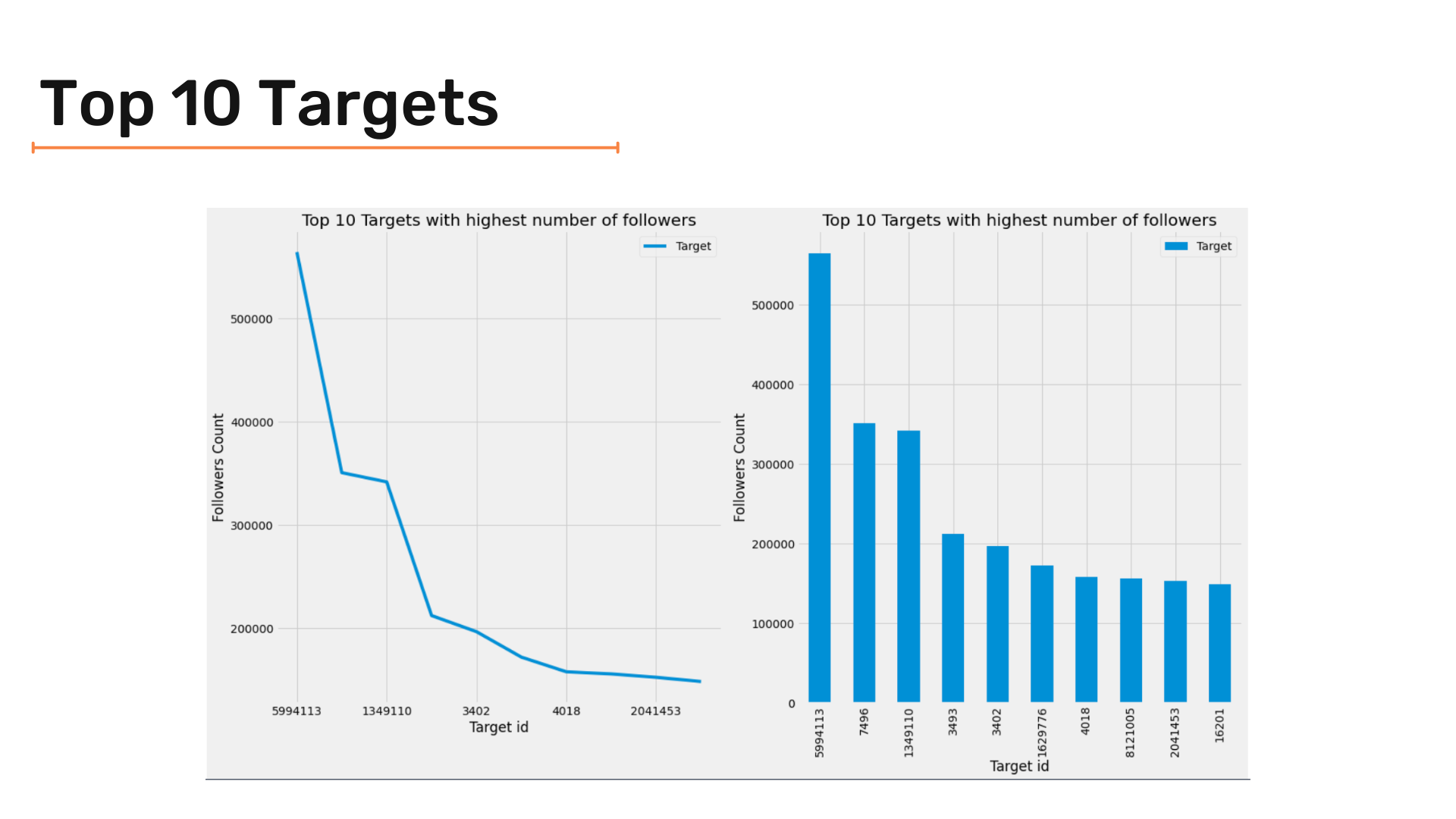
After seeing followers with the most followers, let's go to the other side and see which target has the most followers. We will use the same criteria we used to analyze followers with the most following by plotting top 10 and top 20 targets.
Let's start with a similar code snippet we used before to get top targets; however, we need to create a new pandas dataframe to select data and apply functions because the target column is complex and can break the kernel. The snippet given below does that:
F_vc = pd.DataFrame(twitter_df['Target'].value_counts().iloc[:10])
F_vc = F_vc.reset_index()
F_vc['index'] = F_vc['index'].apply(lambda x:str(x))
F_vc = F_vc.set_index('index')
Similarly, we can use a subplot and create the following two plots:
- Line plot
- Bar plot
'''
Graph Top 10 Targets with highest number of followers
Using subplot to create the following 2 plots:
Line plot at axis 0
Bar plot at axis 1

'''
_, axes = plt.subplots(1,2, figsize=(18,10))

F_vc.plot(ax = axes[0]) ;
F_vc.plot(kind = 'bar' , ax = axes[1]) ;

axes[0].set(xlabel="Target id", ylabel="Followers Count") ;
axes[1].set(xlabel="Target id", ylabel="Followers Count") ;


axes[0].set_title('Top 10 Targets with highest number of followers') ;
axes[1].set_title('Top 10 Targets with highest number of followers');


plt.tight_layout()
We are trying to get the top 20 targets. For that, we use a similar approach to plot it. Below code snippet does so:
F_vc_20 = pd.DataFrame(twitter_df['Target'].value_counts().iloc[:20])
F_vc_20 = F_vc_20.reset_index()
F_vc_20['index'] = F_vc_20['index'].apply(lambda x:str(x))
F_vc_20 = F_vc_20.set_index('index')
'''
Graph Top 20 Targets with highest number of followers
Using subplot to create the following 2 plots:
Line plot at axis 0
Bar plot at axis 1
'''
_, axes = plt.subplots(1,2, figsize=(18,10))
F_vc_20.plot(ax = axes[0]) ;
F_vc_20.plot(kind = 'bar' , ax = axes[1]) ;
axes[0].set(xlabel="Target id", ylabel="Followers Count") ;
axes[1].set(xlabel="Target id", ylabel="Followers Count") ;
axes[0].set_title('Top 20 Targets with highest number of followers') ;
axes[1].set_title('Top 20 Targets with highest number of followers');
plt.tight_layout()The results are as follows:
Segmentation of Followers and Targets:
We can segment/bucket the data into chunks of 10-100, 100-1000, and so on snd check how many followers are there in each segment.
So how exactly is segmentation done? Let's learn.
First, we need to get the number of follows for each follower.
# Get number of follows for each follower
df = pd.DataFrame(twitter_df['Follower'].value_counts())
# create new dataframe with follower id and number of follows of that follower
df = df.reset_index().set_axis(['Follower', 'NumOfFollows'], axis=1, inplace=False)
You can see that we made a column for the number of follows. The next step is to do the segmentation. We can do so using the following function:
'''
Function to create segmentation

Given :
value : the number to do segmentation upon

returns :
The segment the number is in
'''
def Segmentation (value):
    if value > 100000 :
        return "> 100000"
    elif 100000 >= value > 10000 :
        return '10000 +'
    elif 10000 >= value > 1000 :
        return '1000 +'
    elif 1000 >= value > 100 :
        return '100 +'
    elif 100 >= value > 10 :
        return '10 +'
    else :
        return '<= 10'
By applying this function to NumOfFollows the column we can successfully create the segmentation of followers. The following snippet does so:
# Applying segmentation on dataframe
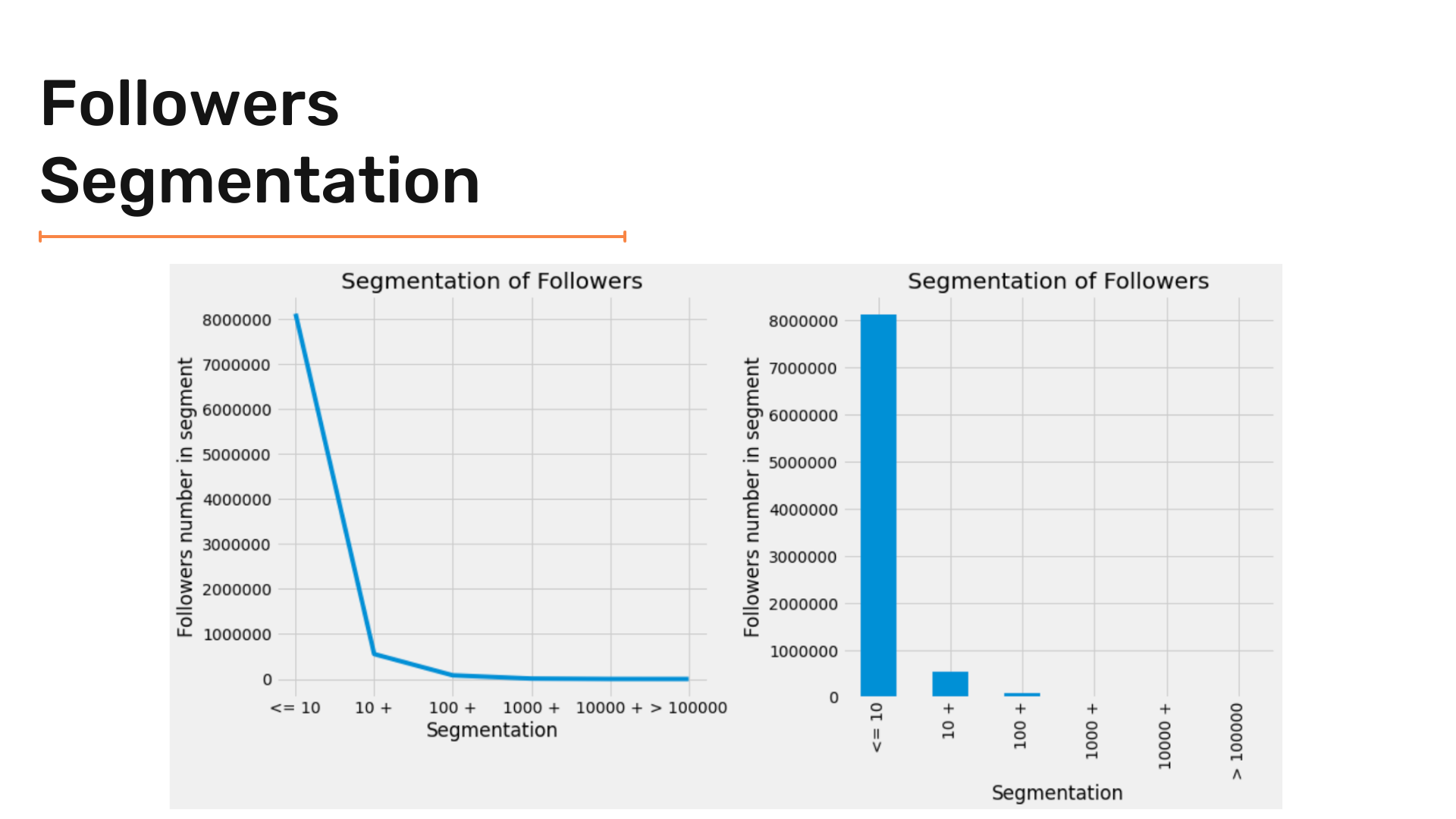
df['Segmentation'] = df['NumOfFollows'].apply(Segmentation)The final result is as follows :


Now, let's visualize the results of the segmentation of followers.
As we did in previous steps, we're using two plot types- line and bar charts to plot the visualizations clearly.
'''
Graph Segmentation of Followers
Using subplot to create the following 2 plots:
Line plot at axis 0
Bar plot at axis 1

'''

_, axes = plt.subplots(1,2, figsize=(14,7))

df['Segmentation'].sort_index().value_counts().plot(ax = axes[0]) ;
df['Segmentation'].sort_index().value_counts().plot(kind = 'bar' , ax = axes[1]) ;

axes[0].set(xlabel="Segmentation", ylabel="Followers number in segment") ;
axes[1].set(xlabel="Segmentation", ylabel="Followers number in segment") ;


axes[0].set_title('Segmentation of Followers') ;
axes[1].set_title('Segmentation of Followers');

axes[0].ticklabel_format(axis="y", style='plain')
axes[1].ticklabel_format(axis="y", style='plain')

plt.tight_layout()
Now, let's see the results of our visualization!
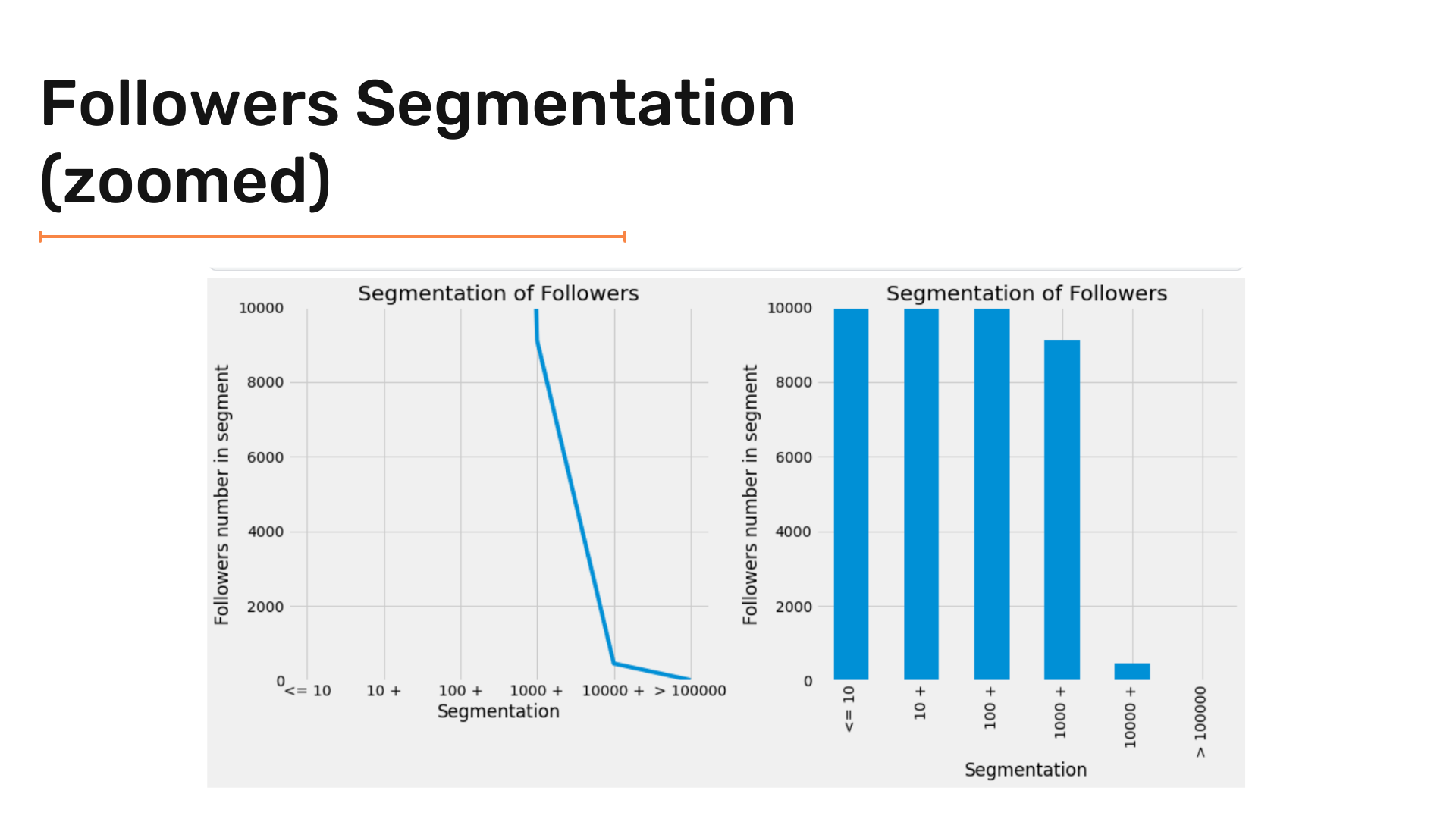
Let's zoom in to see the results clearly.
'''
Setting y-axis limits
'''
axes[0].set_ylim([0,10000])
axes[1].set_ylim([0,10000])
Let's check the results:
Now let's use another kind of chart.
Here, we are plotting a Waffle chart. Let's first understand what a Waffle Chart is.
- Waffle Chart - A Waffle Chart is a gripping visualization technique that is normally created to display progress towards goals. While creating a new figure or activating an existing figure, we can use
FigureClass=Waffle. It is a lot like a pie chart.
So we are going to use PyWaffle to plot the same.
'''
Graph Segmentation of Targets
Using waffle chart
'''

data = df['Segmentation'].value_counts().to_dict()
fig = plt.figure(
    FigureClass=Waffle,
    figsize = (16,12) ,
    rows=20,
    columns = 60 ,
    values=data,
    title={'label': 'Followers Segment Groups Distribution', 'loc': 'center'},
    labels=["{0} ({1}%)".format(k, str(v/df['Segmentation'].value_counts().sum()*100)[:5]) for k, v in data.items()],
    legend={'loc': 'lower left', 'bbox_to_anchor': (0, -0.4), 'ncol': len(data), 'framealpha': 0}
)
fig.gca().set_facecolor('#EEEEEE')
plt.show()
We get the following visualization.

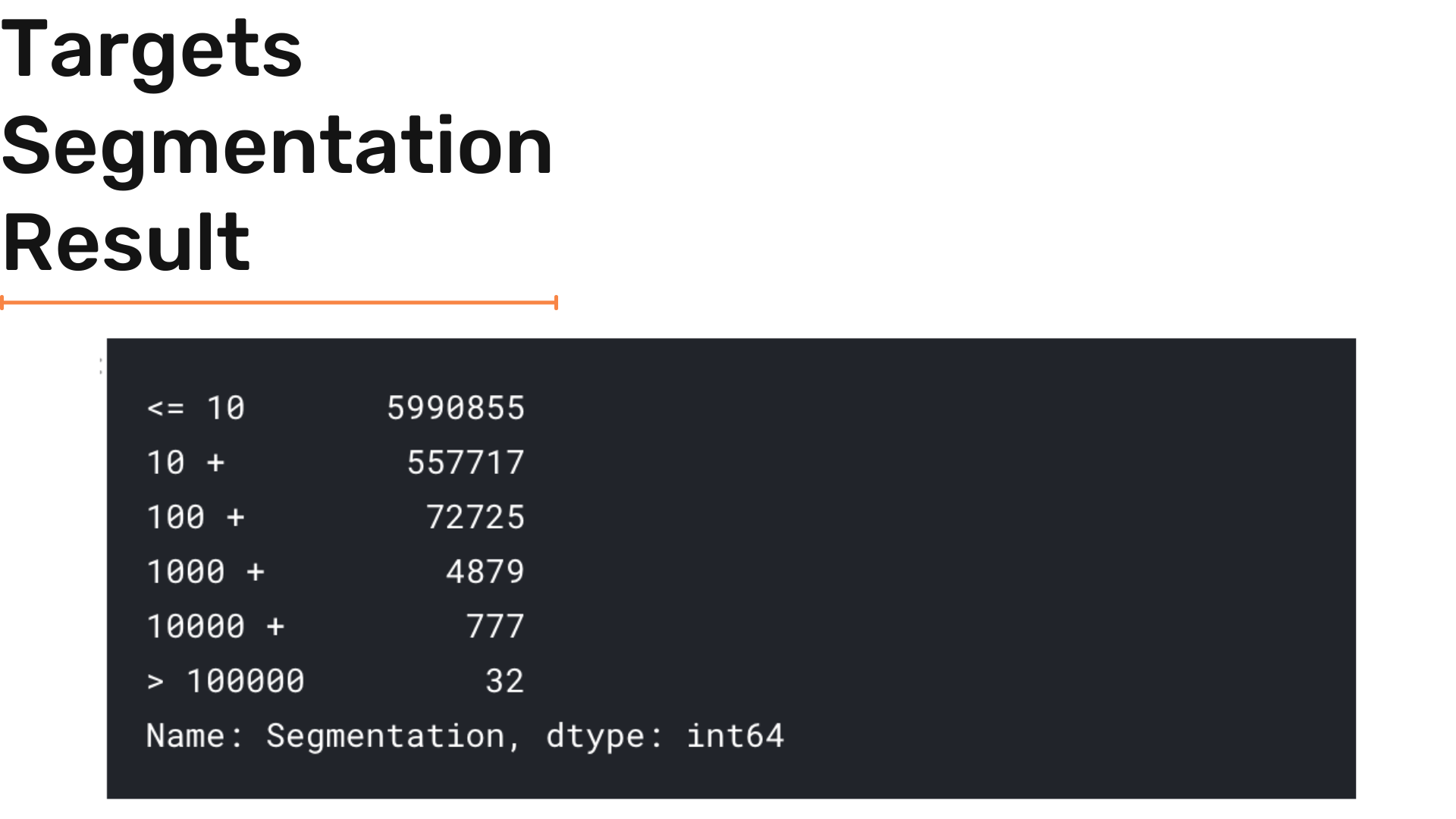
By using similar criteria to targets we can do segmentation to targets.
Code for Target Segmentation is as follows:
# Get number of followers for each target
target_df = pd.DataFrame(twitter_df['Target'].value_counts())
# Create new dataframe with target id and number of followers
target_df = target_df.reset_index().set_axis(['Target', 'NumOfFollows'], axis=1, inplace=False)
# Apply segmentation function
target_df['Segmentation'] = target_df['NumOfFollows'].apply(Segmentation)
We get the following result:

Now, by following the same visualization criteria we can do the bar + line + waffle charts by using the code below:
'''
Graph Segmentation of Targets
Using subplot to create the following 2 plots:
Line plot at axis 0
Bar plot at axis 1
'''
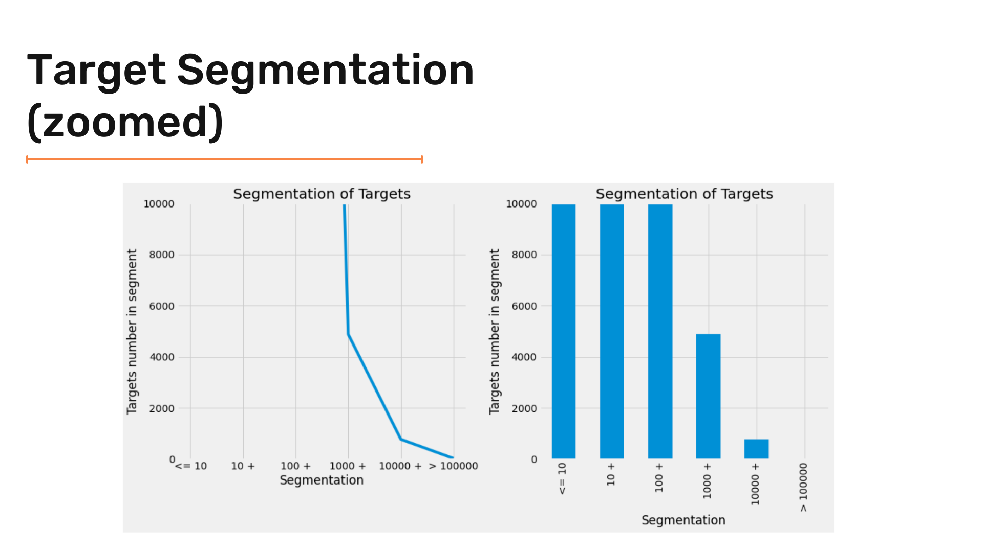
_, axes = plt.subplots(1,2, figsize=(14,7))
target_df['Segmentation'].sort_index().value_counts().plot(ax = axes[0]) ;
target_df['Segmentation'].sort_index().value_counts().plot(kind = 'bar' , ax = axes[1]) ;
axes[0].set(xlabel="Segmentation", ylabel="Targets number in segment") ;
axes[1].set(xlabel="Segmentation", ylabel="Targets number in segment") ;
axes[0].set_title('Segmentation of Targets') ;
axes[1].set_title('Segmentation of Targets');
axes[0].ticklabel_format(axis="y", style='plain')
axes[1].ticklabel_format(axis="y", style='plain')
plt.tight_layout()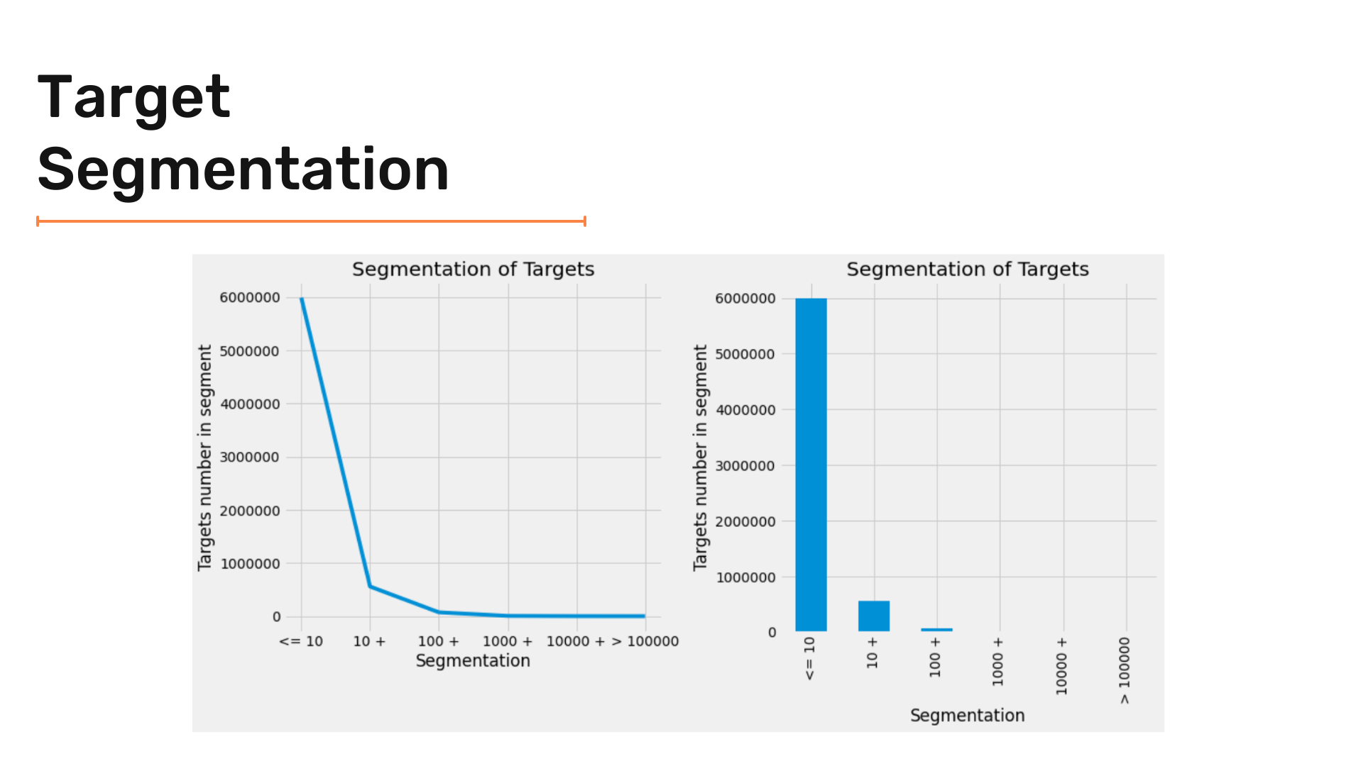
And by zooming in :
And finally creating the Waffle Chart :
'''
Graph Segmentation of Targets
Using waffle chart
'''
data = target_df['Segmentation'].value_counts().to_dict()
fig = plt.figure(
    FigureClass=Waffle,
    figsize = (16,12) ,
    rows=20,
    columns = 60 ,
    values=data,
    title={'label': 'Target Segment Groups Distribution', 'loc': 'center'},
    labels=["{0} ({1}%)".format(k, str(v/target_df['Segmentation'].value_counts().sum()*100)[:5]) for k, v in data.items()],
    legend={'loc': 'lower left', 'bbox_to_anchor': (0, -0.4), 'ncol': len(data), 'framealpha': 0}
)
fig.gca().set_facecolor('#EEEEEE')
plt.show()
Giving us the result:

Conclusion:
So finally, we are at the end of the article.
EDA can be a useful tool to understand your data and identify useful patterns within the data. This gives you a competitive advantage over people who try to cut corners.
Well, of course, there is a lot more in EDA than we just covered here.
To sum up the article, we can say that it is really important to understand your data. The way to understand data is to look at it and then take informed further steps.
Hope this article helped you and gave you a clearer vision of how to perform exploratory data analysis on simple datasets.
Stay tuned for more!
See you next time!